Tutorial 7 — Plotting results (reading the numbers as curves)
Goal: turn a solved run into interactive plots. You'll open the Plot panel, pick channels from the bottom Results / Requests browser, overlay several curves, keep the plot playhead locked to the animation, build a phase portrait with a custom X-axis, spread work across plot pages, and export a PNG. This is where a simulation stops being an animation you watch and becomes data you read.
Time: ~20 minutes · Prerequisites: Tutorial 2 (the pendulum) and Tutorial 6 (its Angle Request — we plot that here).
Concept — a channel is one number, every frame
A finished run holds far more than the animation shows. Every solved frame stored a value for each of the model's quantities — a body's height, a node's velocity, a joint's reaction force, and every Request you defined in Tutorial 6. A single one of those quantities, sampled frame after frame, is a channel: one number versus time. Plotting is just drawing a channel so you can read its shape — a period, a decay, a steady state — instead of judging it by eye on the playback bar.
BriskFyr splits channels into two families, and the browser at the bottom of the Plot panel has one column per family:
- Results — the raw solver output for every node and joint: position (
px/py/pz), velocity (vx/vy/vz,|v|), angular velocity (wx/wy/wz,|w|), and, for any joint that carried a load, its reaction force (Fx/Fy/Fz,|F|) and moment (Mx/My/Mz,|M|). - Requests — the named measurements you defined yourself in Tutorial 6 (the Distance, Angle, Force channels). These are the ones with physical meaning you chose.
There's no "add plot" button — the Plot panel appears on its own the first time a run produces results.
Get a run with a Request on it
1. Open the pendulum (with its Angle Request) and Solve
Re-open your Tutorial 6 model — the pendulum carrying the Angle Request (Body I = the pendulum, Body J = Ground, Axis (0, 1, 0)). If you don't have it saved, rebuild the pendulum (Tutorial 2, ~60 s) and add the Angle Request (Tutorial 6, Step 5). Solve for 5 s.
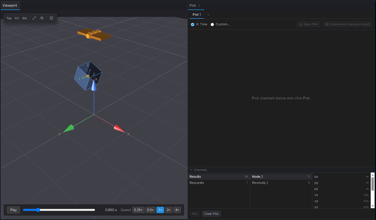
Expected: the moment the run finishes, a Plot panel opens beside the viewport. Its chart is empty and reads "Pick channels below and click Plot," with a three-column channel browser underneath.
Plot your first channel
2. Plot the swing angle versus time
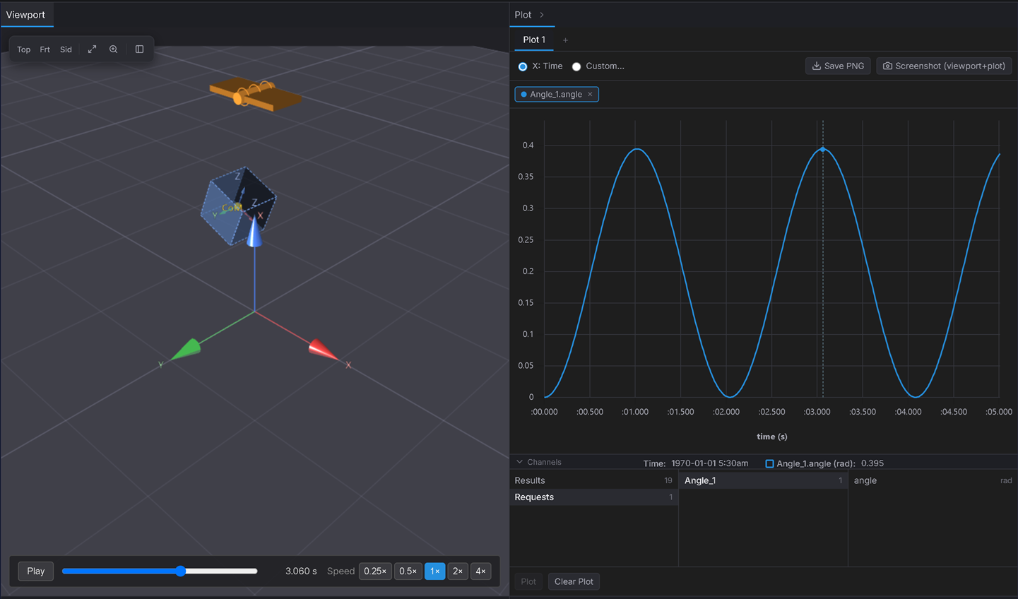
In the bottom browser, click Requests in the first column (the source), your Angle request in the middle column, then the angle channel in the third column. Click Plot.
Expected: a clean sinusoid — the swing angle rising and falling. Read one full cycle off the x-axis: it should match Tutorial 2's ≈ 2.0 s period, now measured off an axis instead of eyeballed. A coloured curve chip appears above the chart.
3. Overlay a Results channel — the bob's height
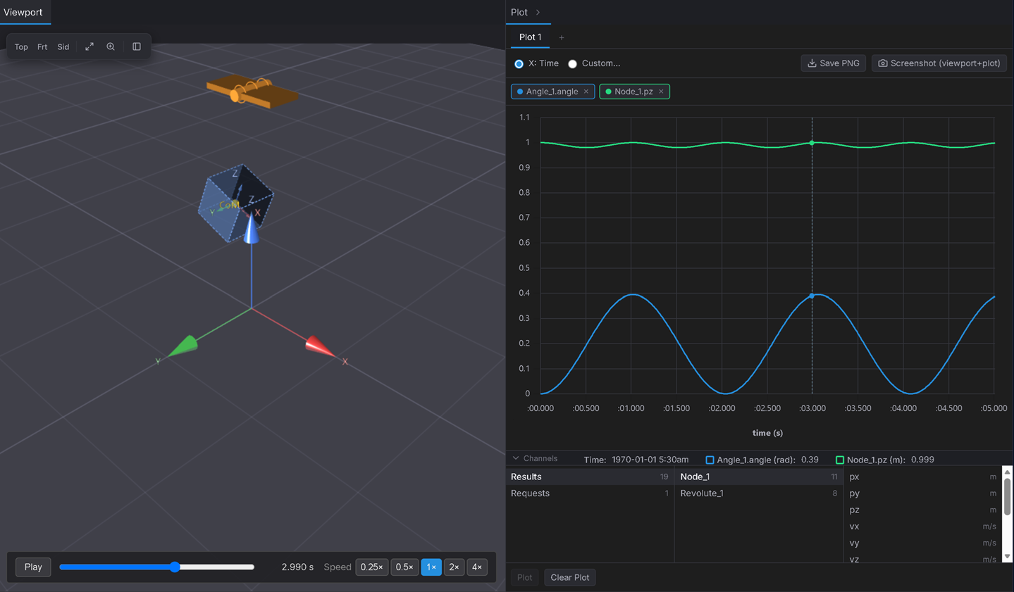
Now switch the first column to Results, pick the mass node in the middle column, and select pz (its height) in the third. Click Plot — new channels append, they don't replace.
Expected: a second curve joins the first — and look at the frequencies. The height oscillates twice as fast as the angle: the bob is highest at both ends of the swing (a height peak at each) and lowest as it passes through the bottom, so it completes two up-and-downs for every single angle cycle. That 2× relationship is a classic pendulum result the plot shows at a glance. Two chips, two colours; remove either with its ×.
Lock the plot to the animation
4. Scrub in either direction
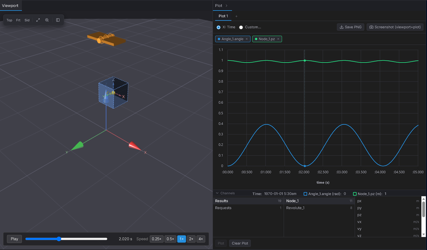
Press Play, or drag the playback bar. Then click a point directly on the plot.
Expected: the plot's cursor line tracks the animation as it plays. And clicking a point on the curve (while X: Time is selected) jumps the 3D animation to that frame — click a peak of the angle curve and the pendulum snaps to that end of its swing; click a mid-height crossing and it snaps to the bottom. Plot and model are two views of the same instant.
Concept — plot one channel against another (a phase portrait)
Time isn't the only thing you can put on the x-axis. Plot a body's angular velocity against its angle — instead of time — and you get a phase portrait: the single most useful picture in dynamics. For an undamped pendulum, energy is conserved, so the orbit closes into a loop; add damping and the same plot would spiral inward toward the centre. The shape of the curve is the physics.
5. Build the phase portrait on a new page
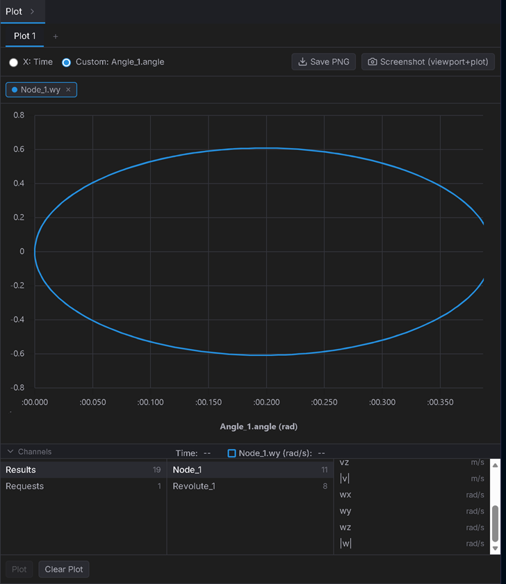
Click the + at the top of the Plot panel to open a fresh plot page (this keeps your angle-vs-time chart intact on page 1 — Step 6). On the new page, plot Results → mass node → wy (angular velocity about the hinge axis). Then switch the X-axis radio from X: Time to Custom… and choose your Angle request as the X channel.
Expected: instead of a sinusoid in time you get one closed loop — angular velocity (Y) versus swing angle (X). The loop is fattest (largest angular velocity) as the pendulum passes through the bottom of its swing, and pinches to zero angular velocity at the left and right tips (the turning points). A closed loop = no energy lost: an undamped pendulum retraces the same orbit forever, while a damped one would spiral inward.
Organise and export
6. Name the pages and export
You now have two plot pages — the time plot (page 1) and the phase portrait (page 2). Double-click each tab to rename it ("Angle" and "Phase portrait"), so you can flip between them like browser tabs, each holding its own independent chart. Then Save PNG exports the current chart, and Screenshot (viewport + plot) captures the 3D view and the plot side by side in one image.
Expected: two named plot-page tabs across the top of the panel; Save PNG downloads the chart as an image.
Verifiable outcome
- The angle-vs-time curve is a sinusoid whose period matches Tutorial 2's ≈ 2.0 s — read off the axis, not the eye. ✅
- Height and angle peak together, confirming the geometry of the swing. ✅
- The phase portrait closes into a loop — the visual signature of a conservative (undamped) oscillator. ✅
- The plot cursor stays locked to the animation both ways, and a PNG exports. ✅
Troubleshooting
- The panel says "Run a simulation to plot results." → there's no result yet; Solve first. The Plot panel only has data after a run.
- I closed the Plot panel and can't find it → it auto-opens once, then it's yours to manage — reopen it from its tab beside the viewport.
- Clicking the plot doesn't move the animation → that only works with X: Time selected. A Custom x-axis has no single frame per x-value (a phase portrait revisits the same angle twice per cycle), so switch back to X: Time to scrub by clicking.
- A channel I expected isn't in the list → a joint's reaction channels only appear if that joint actually carried a load this run; Request channels only appear for Requests you added in Tutorial 6.
- Two runs' curves won't overlay on one chart → comparing separate runs on one plot isn't in this version; plot channels from the current run. (Use plot pages to keep several charts from one run side by side.)